Council on Foreign Relations - Editorial Graphics
- Graphics for CFR's Editorial team
- Tools used: Adobe Illustrator, Excel, QGIS, ai2html, Datawrapper
As part of my work at CFR, I create graphics for the Editorial team's backgrounders and news articles, which are published daily on cfr.org. I've made over 100 charts and maps using a range of tools, usually including Adobe Illustrator. These are some of my favorites.
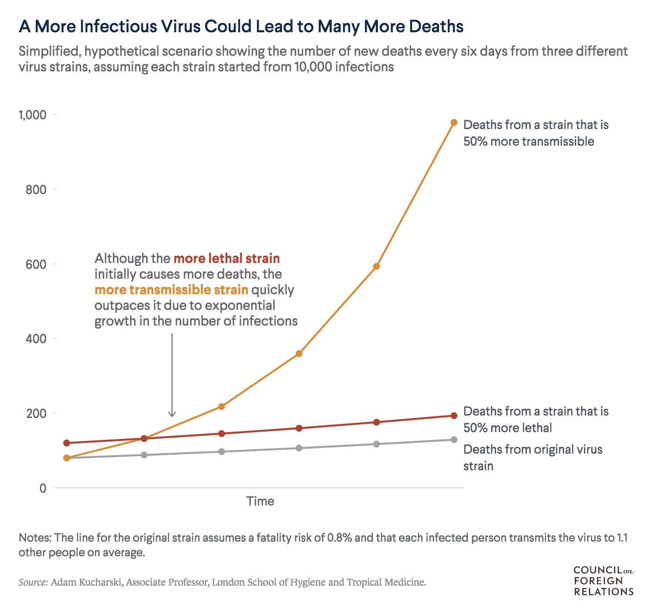
This chart shows why a more contagious covid variant could lead to more deaths than a more lethal variant, using a simple example dataset. After seeing some of the numbers in an Atlantic article, I had the idea to illustrate the concept with a chart and made it in Datawrapper.
I included a detailed annotation with the aim of helping readers understand the role of exponential growth.
https://www.cfr.org/in-brief/how-dangerous-are-new-covid-19-strains
Part of a graphic-driven article on the ten-year anniversary of the Fukushima disaster, this ai2html chart shows energy projections. I suggested this approach to show how nuclear is expected to remain a small share of the world's energy.
https://www.cfr.org/in-brief/fukushima-disaster-didnt-scare-world-nuclear-power
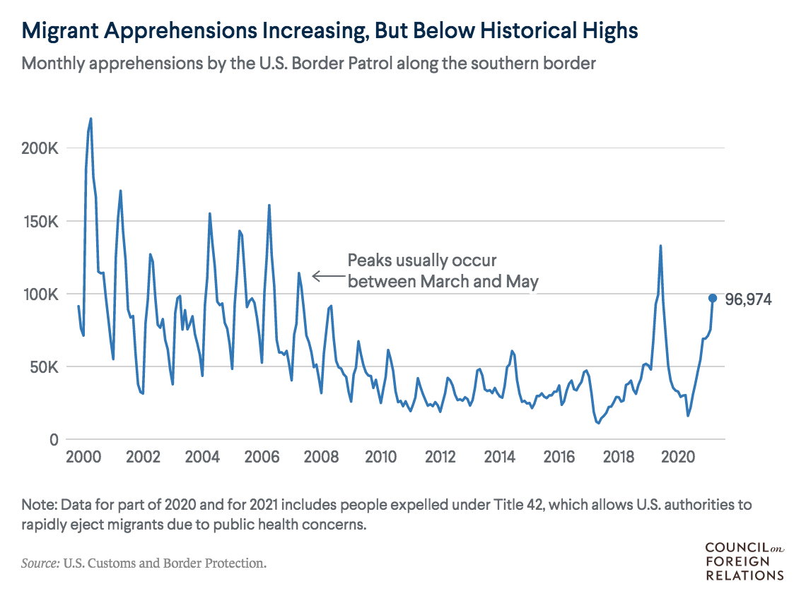
This simple line chart shows apprehensions at the U.S.-Mexico border, with an interesting cyclical pattern. I formulated the title with the goal of helping readers understand the context of the recent increase. The data was gathered from PDFs and I used R to get it into a usable format.
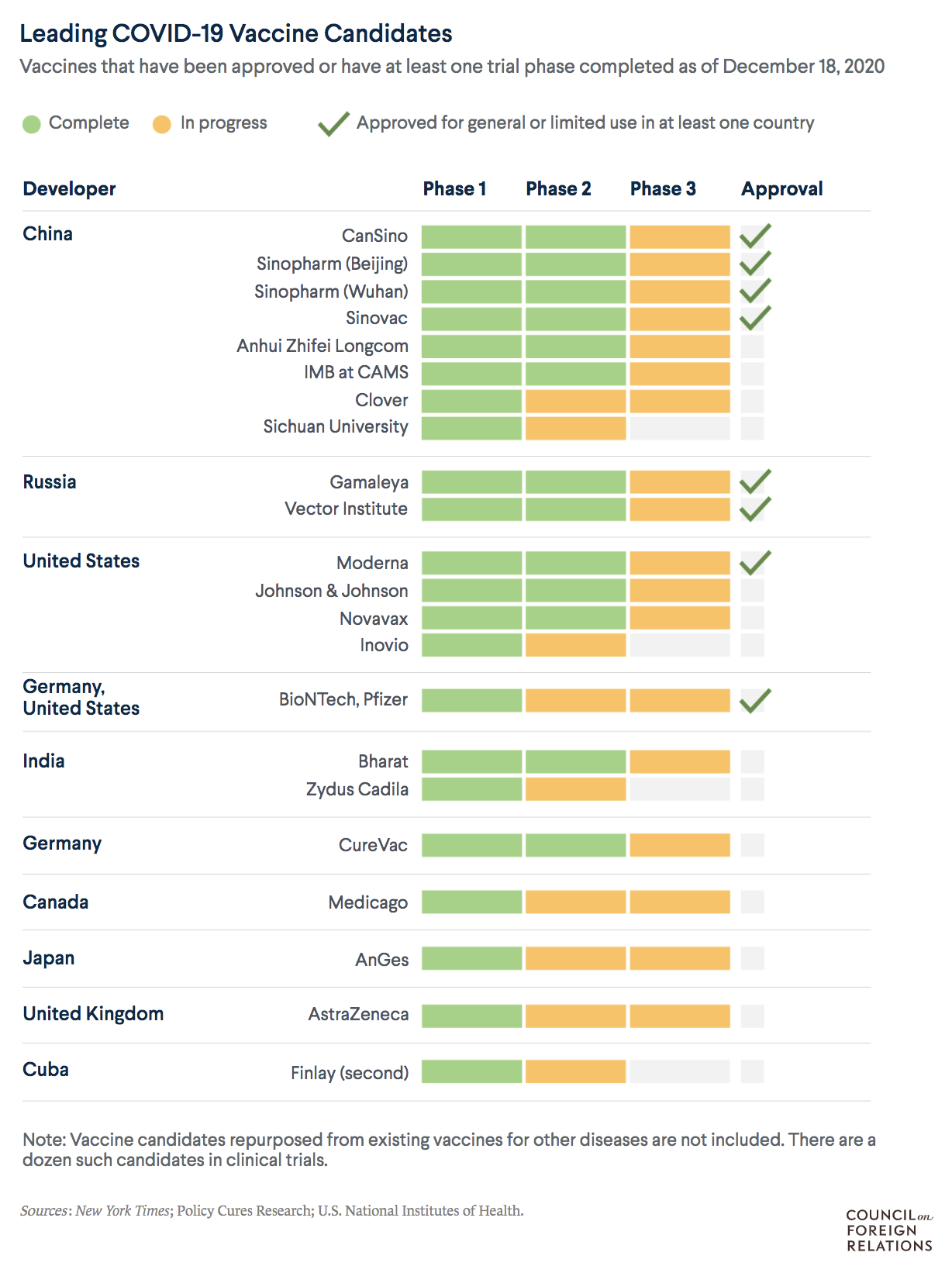
This graphic tracks vaccine candidates with the goal of educating users about the clinical trial phases and showing the large number in development.
https://www.cfr.org/backgrounder/what-world-doing-create-covid-19-vaccine
My goal with this chart was to present a detailed look at countries' movement on abortion laws over the past twenty years.
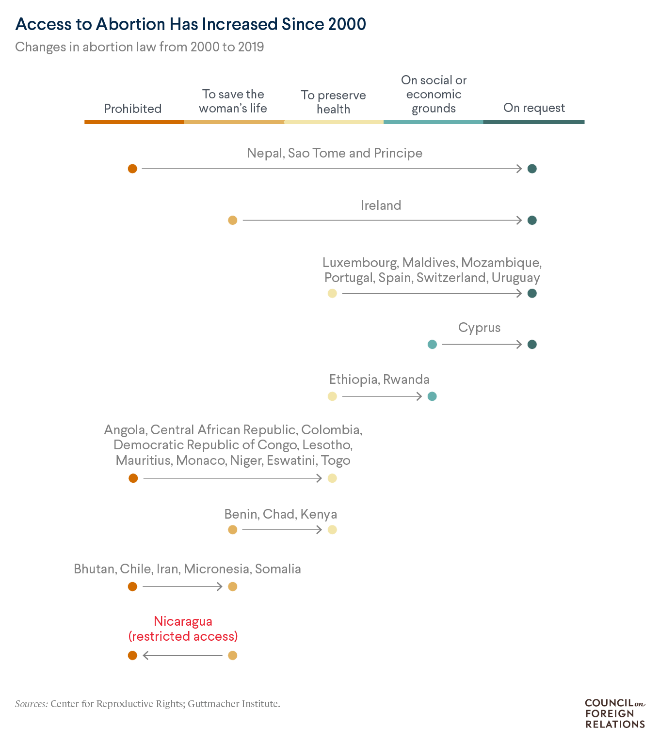
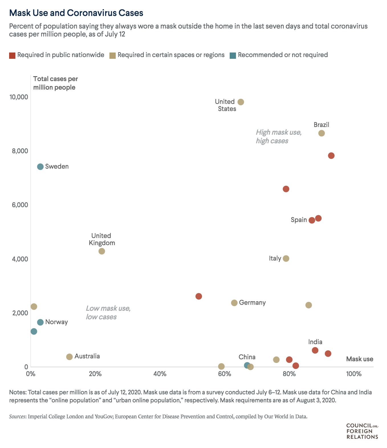
Rather than highlight a single message, this graphic presents the data in a neutral way, letting the user consider the relationship between the three variables.
https://www.cfr.org/in-brief/which-countries-are-requiring-face-masks
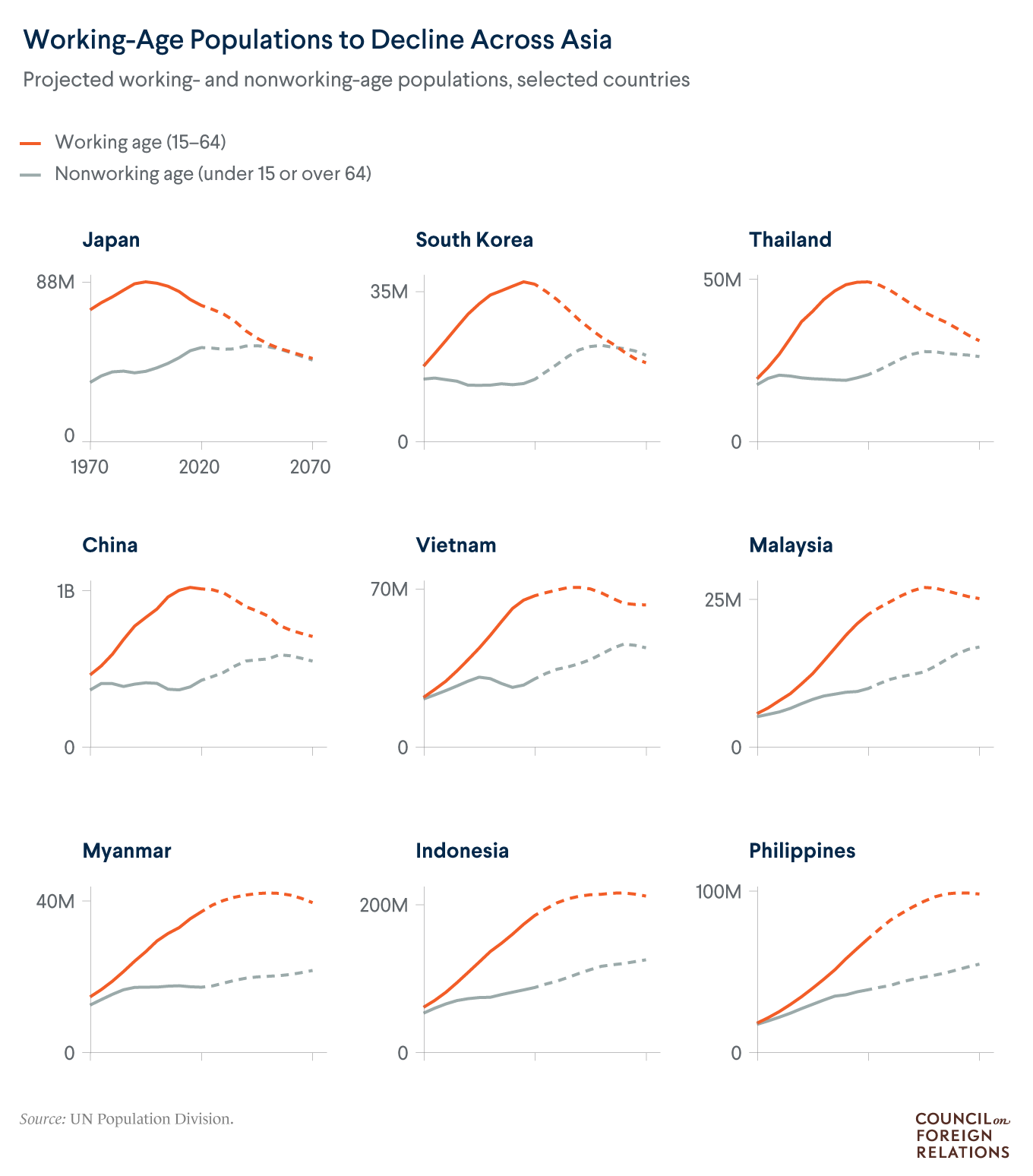
This chart was part of a graphics yearender. I wanted to show the projected decline of working age populations for several countries, so opted for small multiples made in ggplot2, with the older populations highlighted in orange.
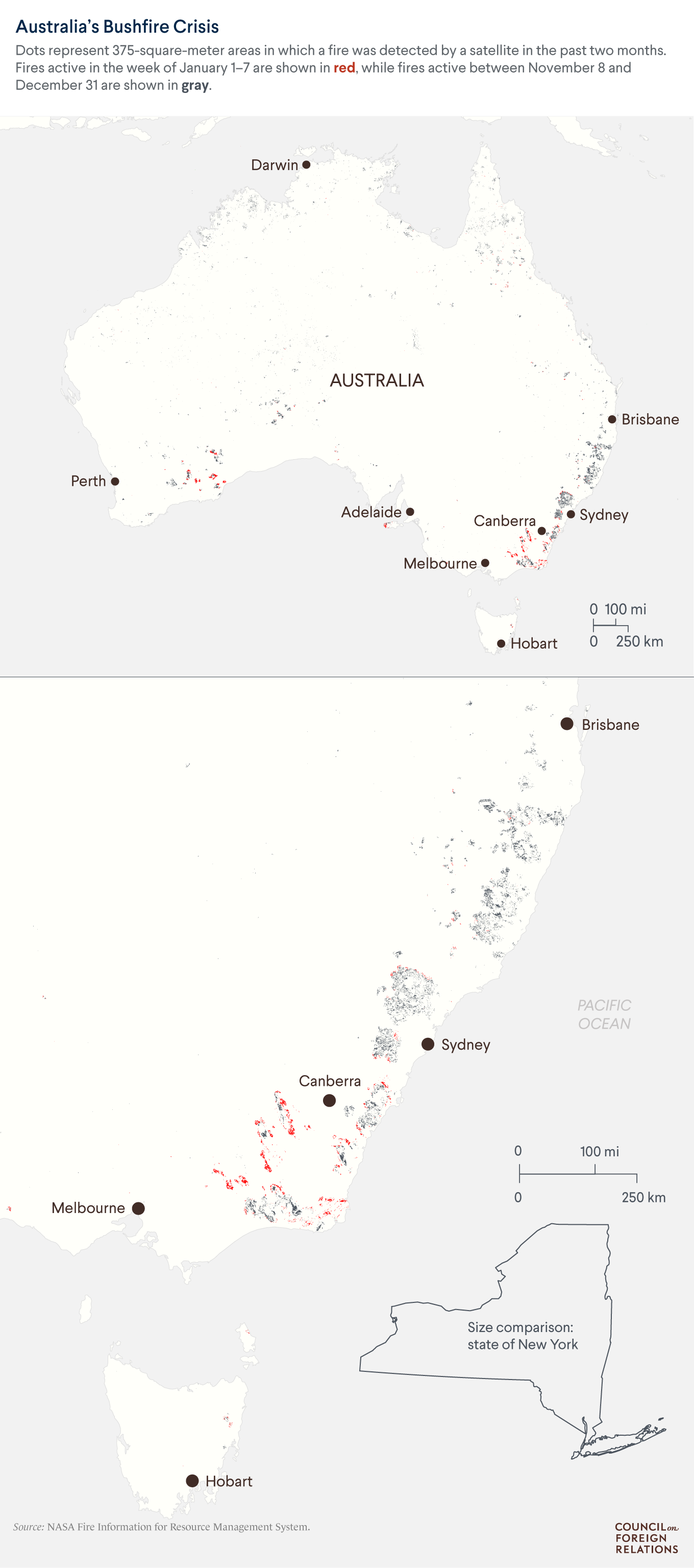
Created with my team, this detailed map shows the locations and extent of wildfires, with a U.S. state as a reference for American audiences.
https://www.cfr.org/in-brief/australias-fires-will-rage-again-heres-how-government-can-prepare
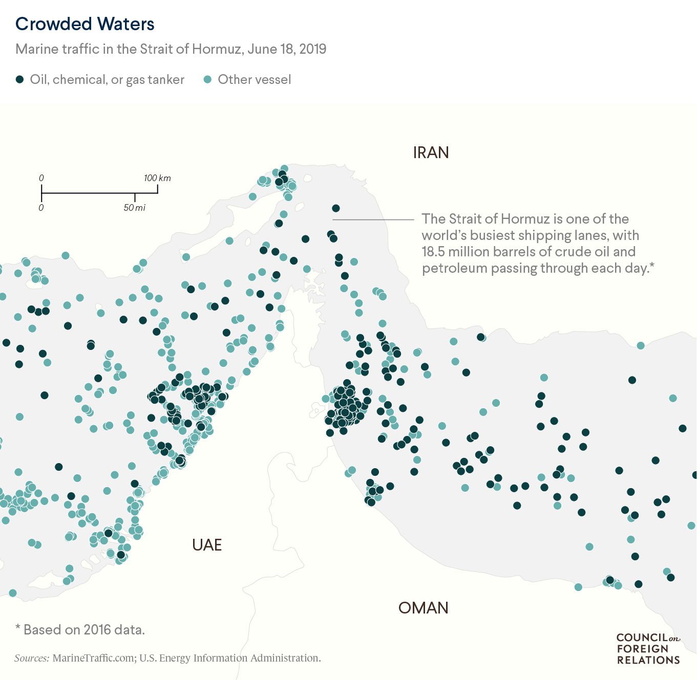
I made this map in QGIS to show the large amount of traffic in the Strait of Hormuz.
https://www.cfr.org/in-brief/strait-hormuz-us-iran-maritime-flash-point
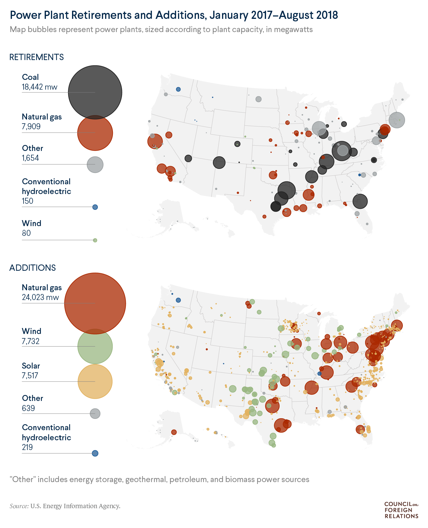
This map was part of a graphic yearender article. We originally started with one map in mind, then decided to present both retirements and additions.