Child Mortality and Access to Cities
- Project for Intro to GIS, spring 2020
- Tools used: QGIS, R
- Full report: INFO_609_Final_Project.pdf
Analysis
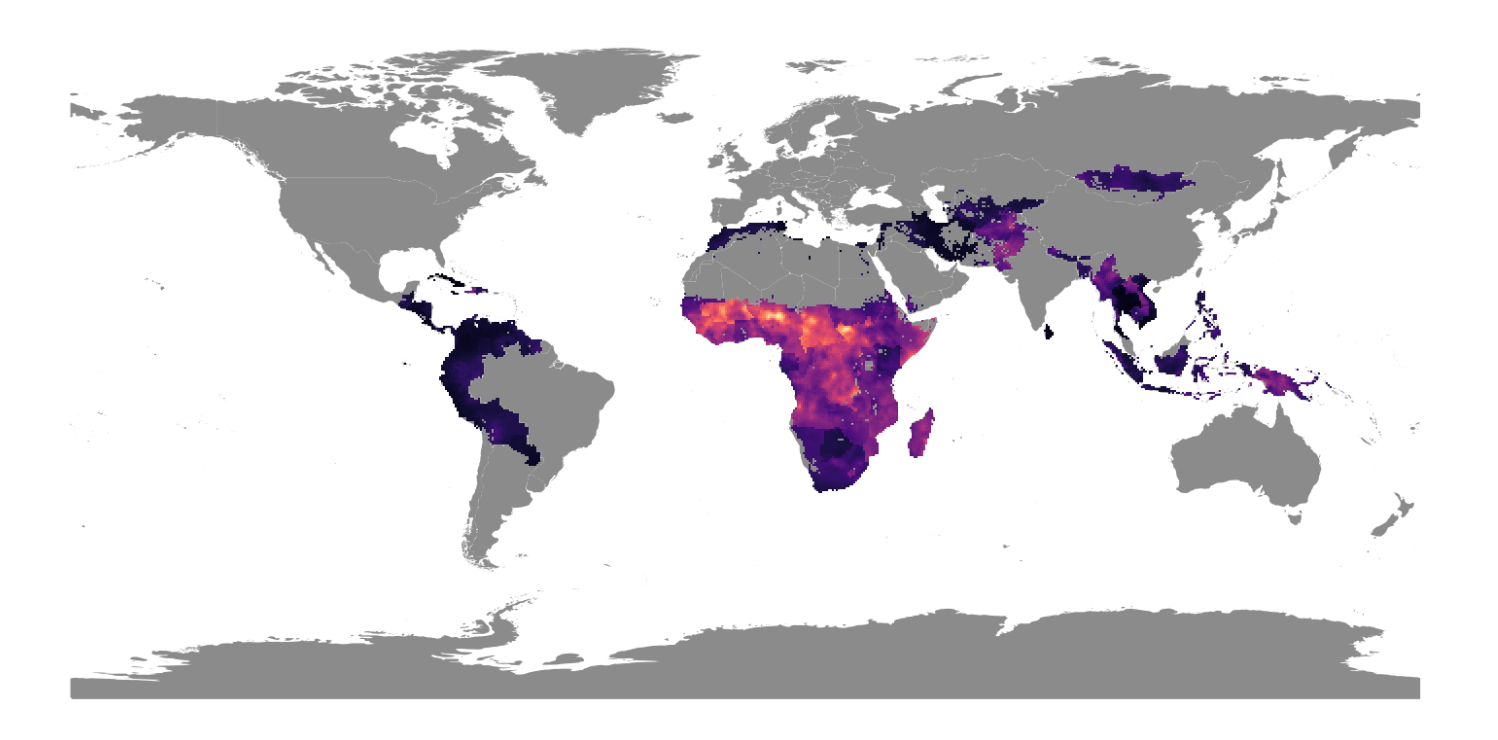
In this GIS project, I used granular geospatial data to map the relationship between child mortality and travel time to the nearest city, taking a global scope and focusing on particular countries to look at sub-national trends.
Because access to cities is a continuous variable, we can visualize it using contour lines, and overlay it to analyze the correlation with child mortality. For readability, I overlay one contour line at a time, starting with an access level of 60 minutes to the nearest city.
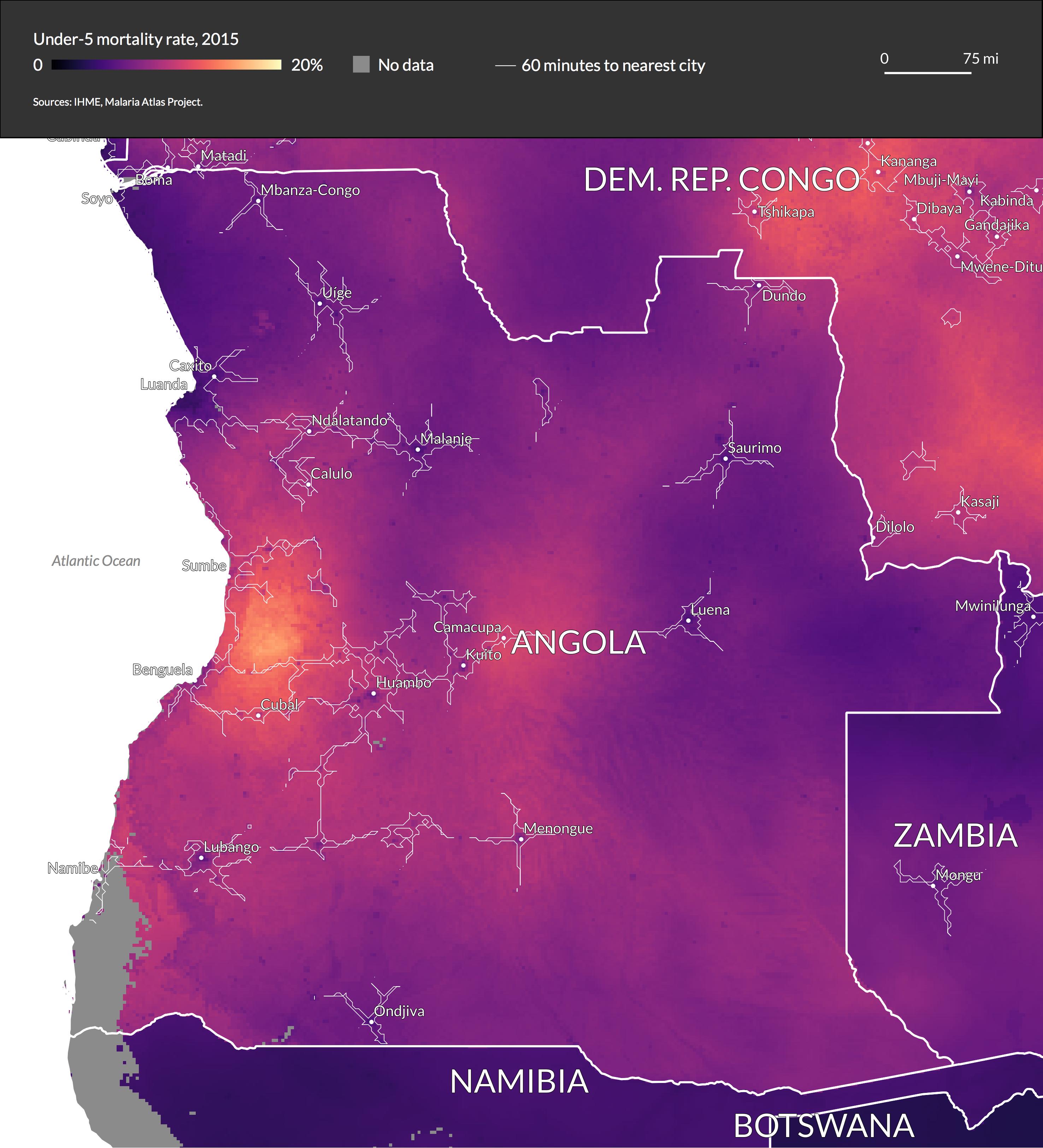
This shows that access to cities is strongly correlated with child mortality rates although there is variation within countries, as in the case of Angola.
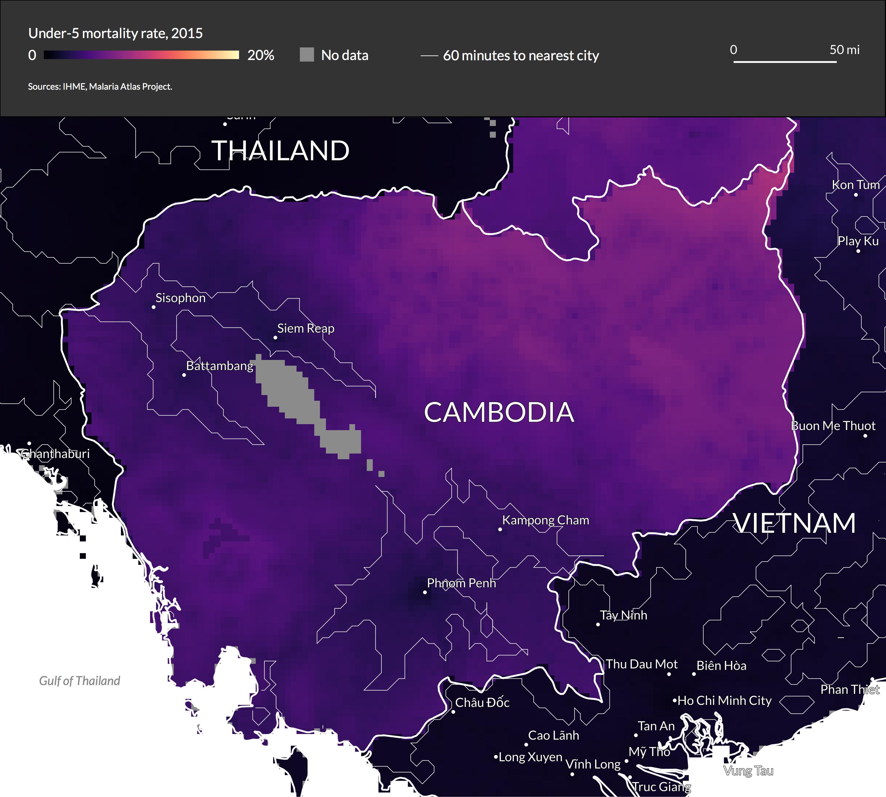
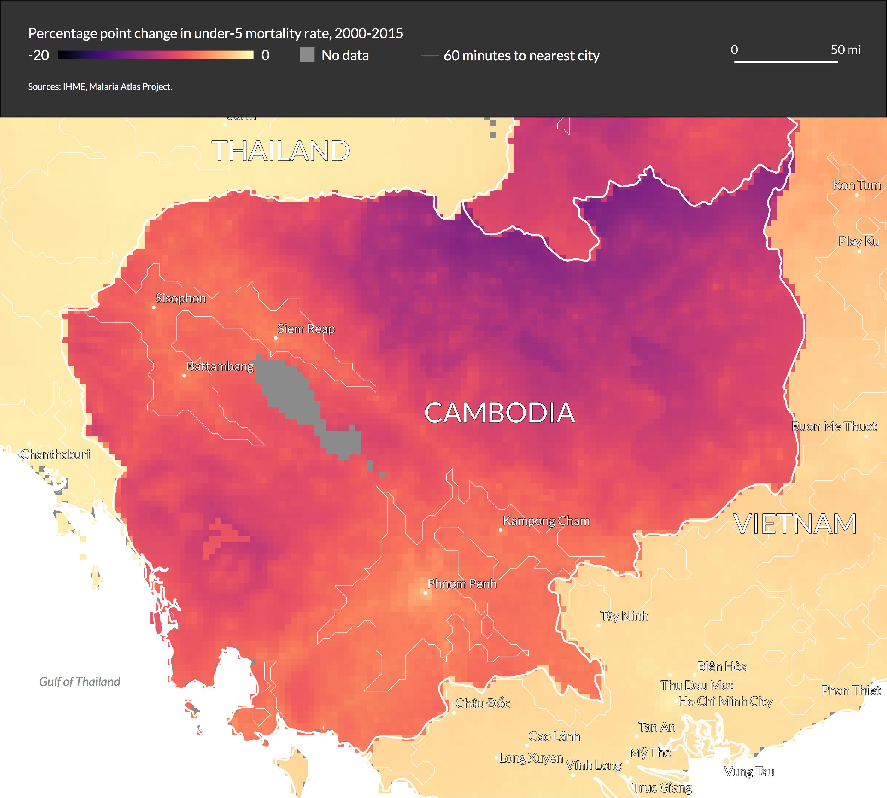
In Cambodia, we see a clear pattern, with the areas with greater access to cities having significantly lower mortality rates. We can also see the stark differences between countries, as child mortality rates in Thailand and Vietnam are near zero, regardless of the level of access to cities.
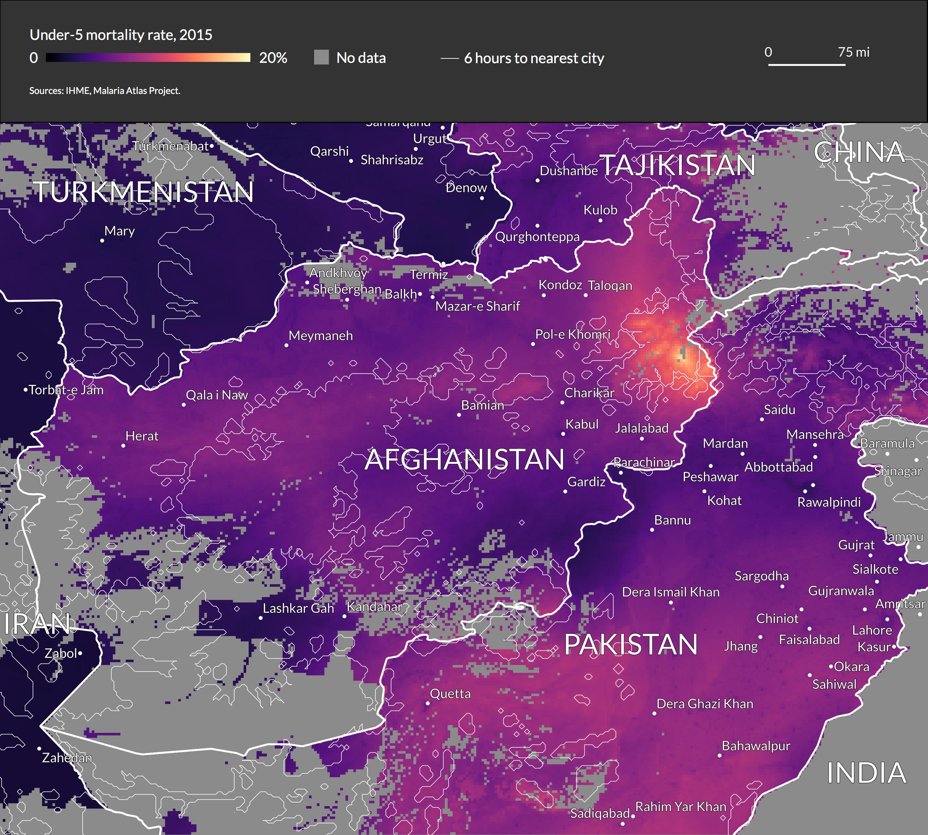
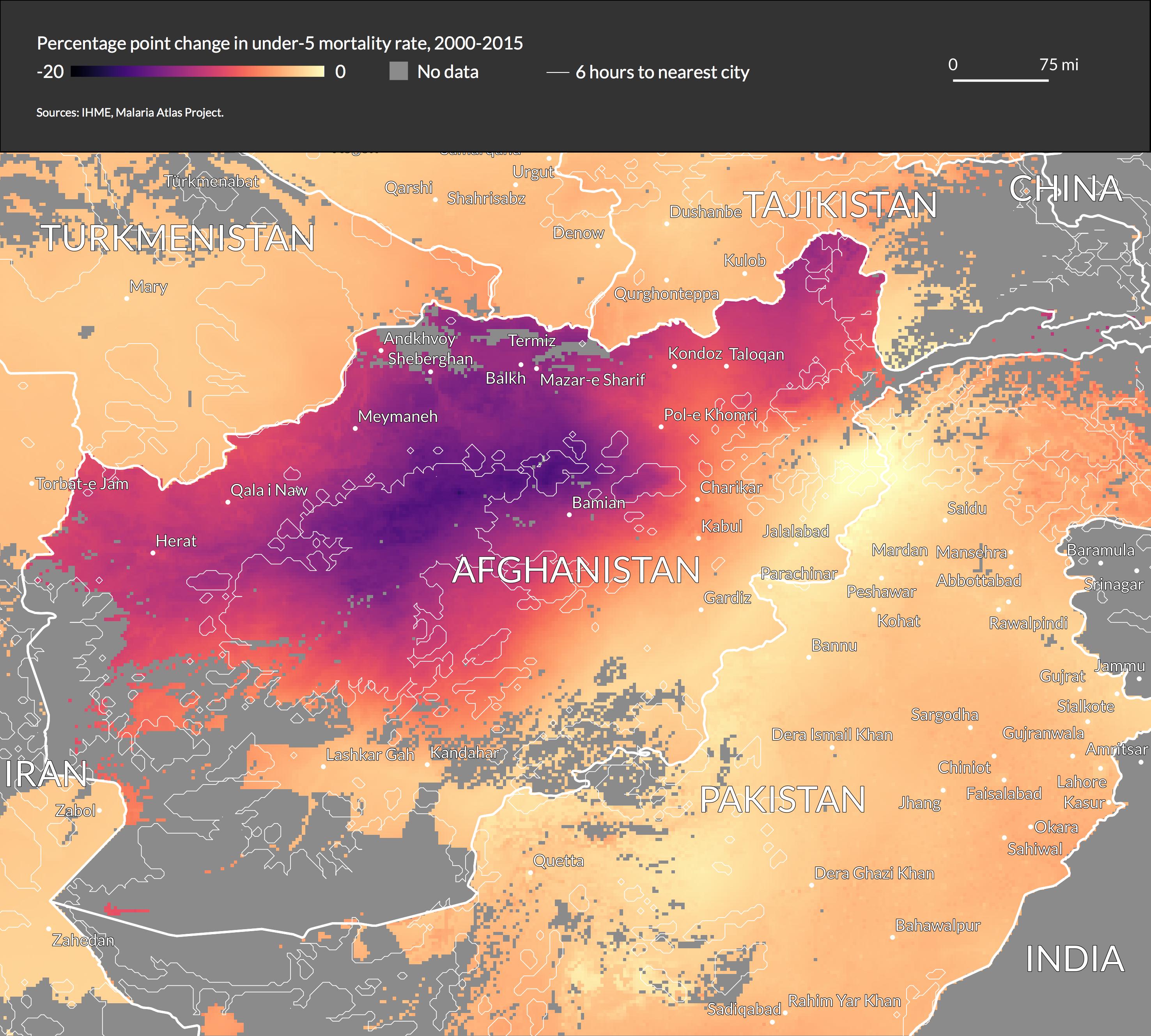
For more rural countries, it is useful to delineate 6 hours of travel time to the nearest city rather than 1 hour. Afghanistan shows a clear pattern when using this delineation.
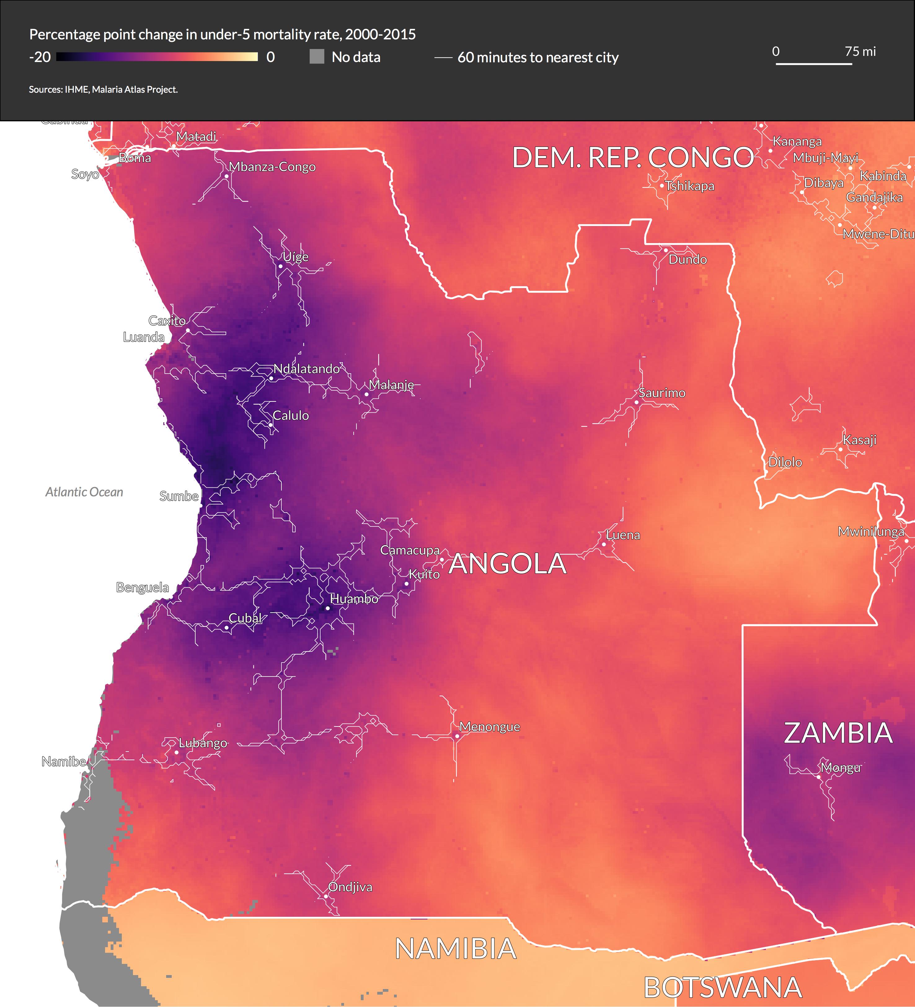
We can also examine the change in child mortality rate from 2000-2015, and how it correlates with access to cities in 2015. Interestingly, the relationship does not always go in the same direction.
In Angola the areas with higher access to cities show the largest progress.
By contrast, in Cambodia the rural areas show the largest improvement, and the cities themselves show a smaller change.
In Afghanistan, the rural areas in the middle of the country show huge improvement. However, the rural area in the northeast of the country (which we saw earlier has a very high mortality rate) does not.
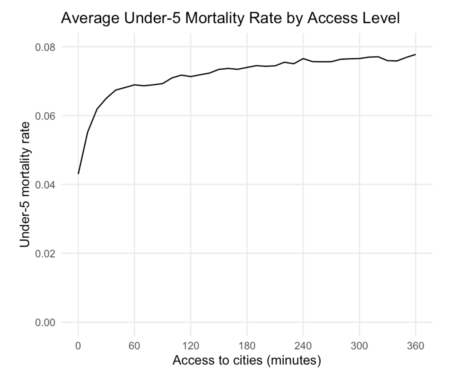
I also used R to analyze how mortality rates vary with access to cities worldwide. Interestingly, increased access results in increasingly better mortality rates: moving from 60 to 30 minutes results in a modest improvement, while moving from 30 to 0 minutes results in a much larger improvement.
For more maps and technical notes on the QGIS operations, view the full report.
Process
The project idea started with finding the incredibly granular child mortality data from the Institute for Health Metrics and Evaluation and wanting to work with it, then thinking about what variables I might be able to overlay.
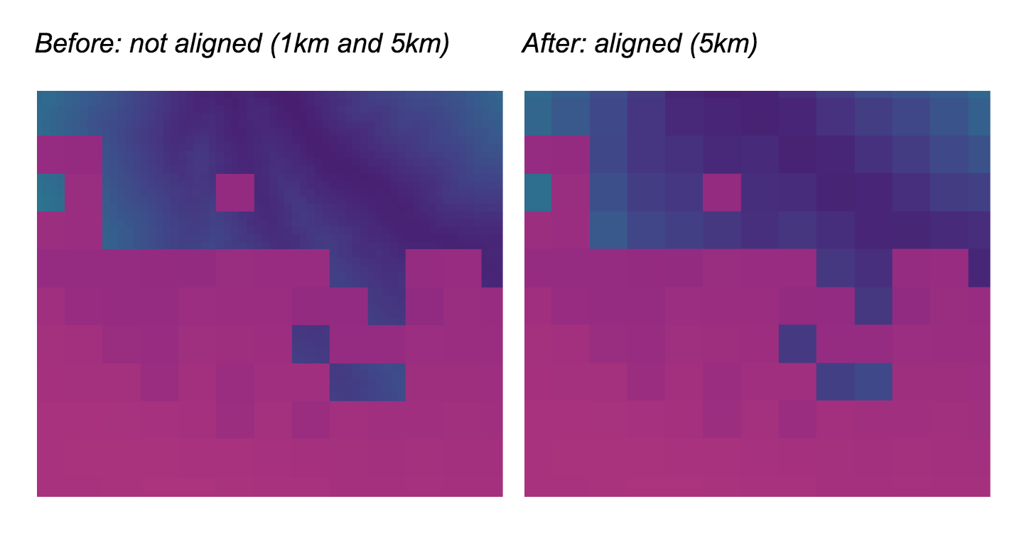
I started with raster data, first aligning the two raster files by downscaling the access to cities data from 1km to 5km resolution as shown here (the access to cities data is in blue and the child mortality data is in purple).
I then created contour lines from the access data and overlaid cities, and finally brought the raster data into R to chart the aggregated data with ggplot.
I decided to use the “magma” color scale since the large changes in brightness and hue do a good job of making small differences visible, without implying divergence from a midpoint. This was important for this dataset, because I wanted variations within countries to be apparent while keeping all countries on the same color scale.
