Public Policy Institute of California - Child Poverty
- A Graphicacy project (my role: design, data analysis, project management)
- Tools used: Adobe Illustrator, Excel, MapBox Studio
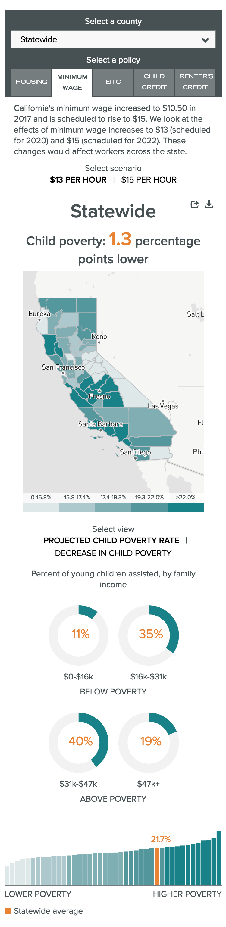
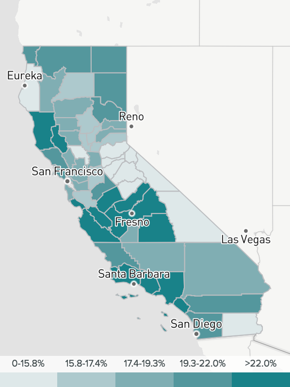
One early design decision was to present a map and bar chart together, displaying the same information. While the map is visually interesting and allows the user to easily find counties of interest, the bar chart is better at communicating the actual data values, the distribution of the dataset, and where a selected county ranks relative to other counties. Using the same color scale on the bar chart helps the user understand the connection.
A key consideration was how to set the scales to ensure that the large differences between different policy scenarios would be apparent. For the map, there was a decision not to use quartiles or quintiles, to ensure that the variation among counties was apparent in the colors on the map. For the bar chart, the y-axis remains the same as the user toggles between policy scenarios, making it easier to tell which policies have the largest impact on poverty.
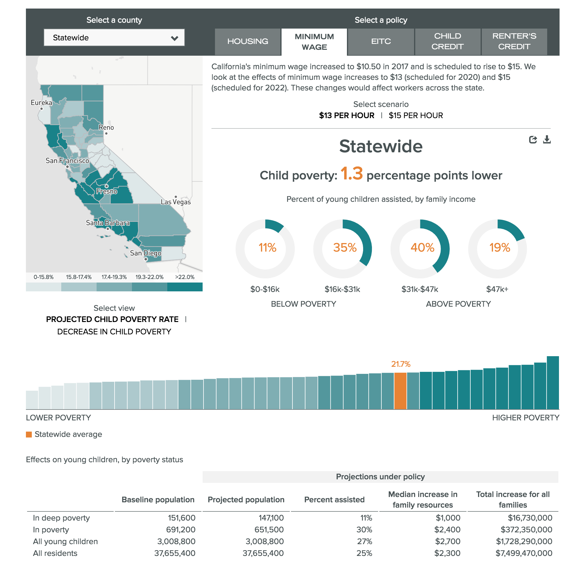
A minimalist base map style places the focus on the colors.
Content stacks responsively on smaller screens.