Lockdowns and Covid Cases
- Project for Information Visualization, fall 2020
- Tools used: Tableau, R
Design
This storytelling project overlays countries’ covid cases with a quantitative index of their lockdown measures, using data from the Oxford Covid-19 Government Response Tracker.
My process included reviewing existing work, brainstorming, analyzing and preparing data in R, testing with users, and designing and building the final product in Tableau. In the future, I'd like to recreate in D3.
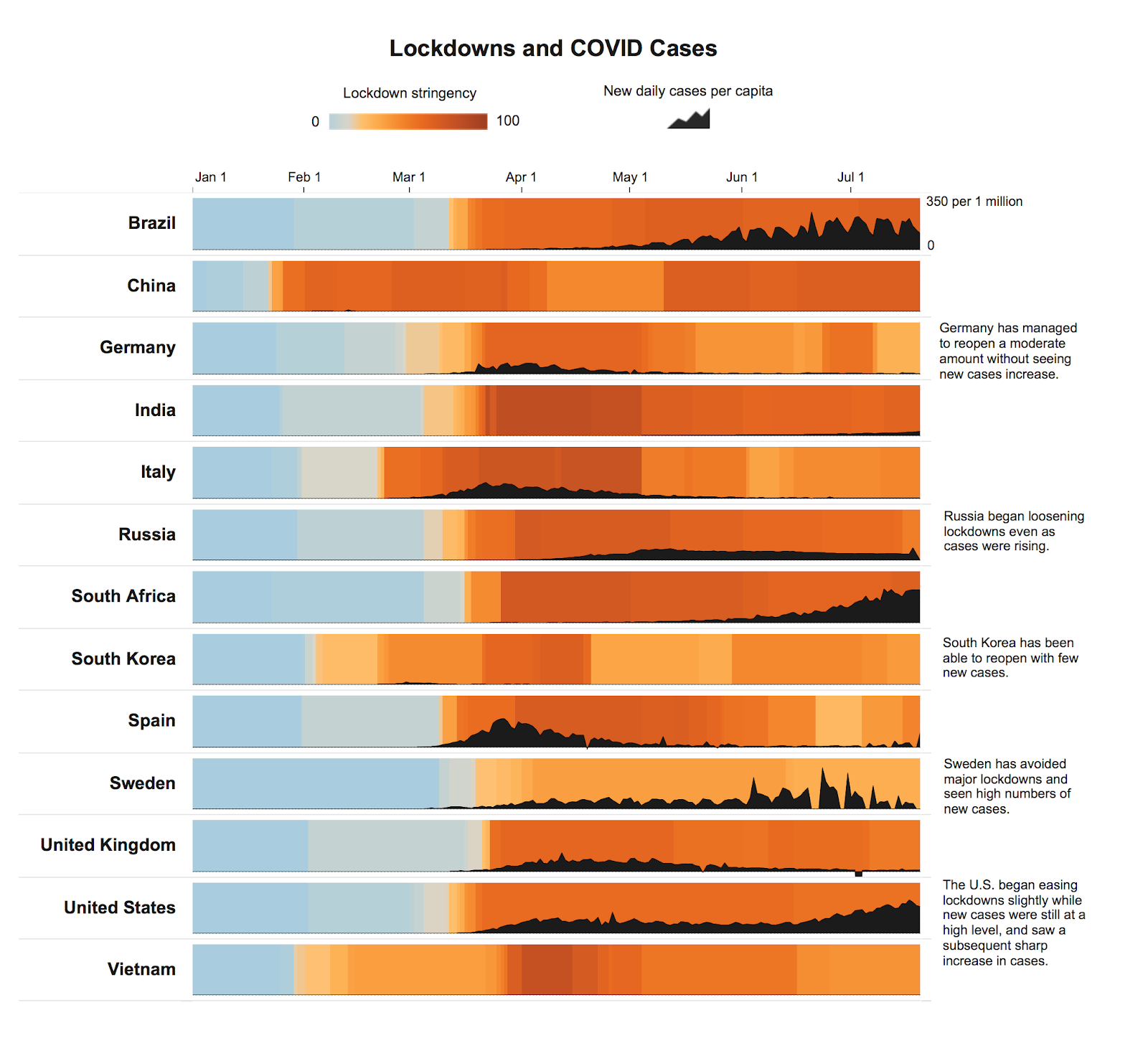
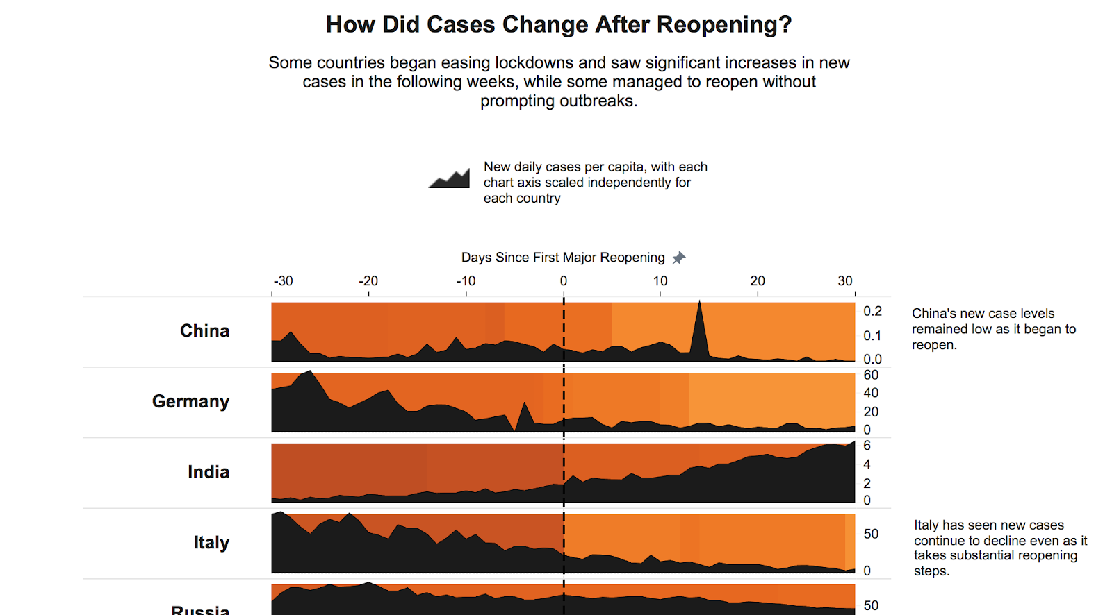
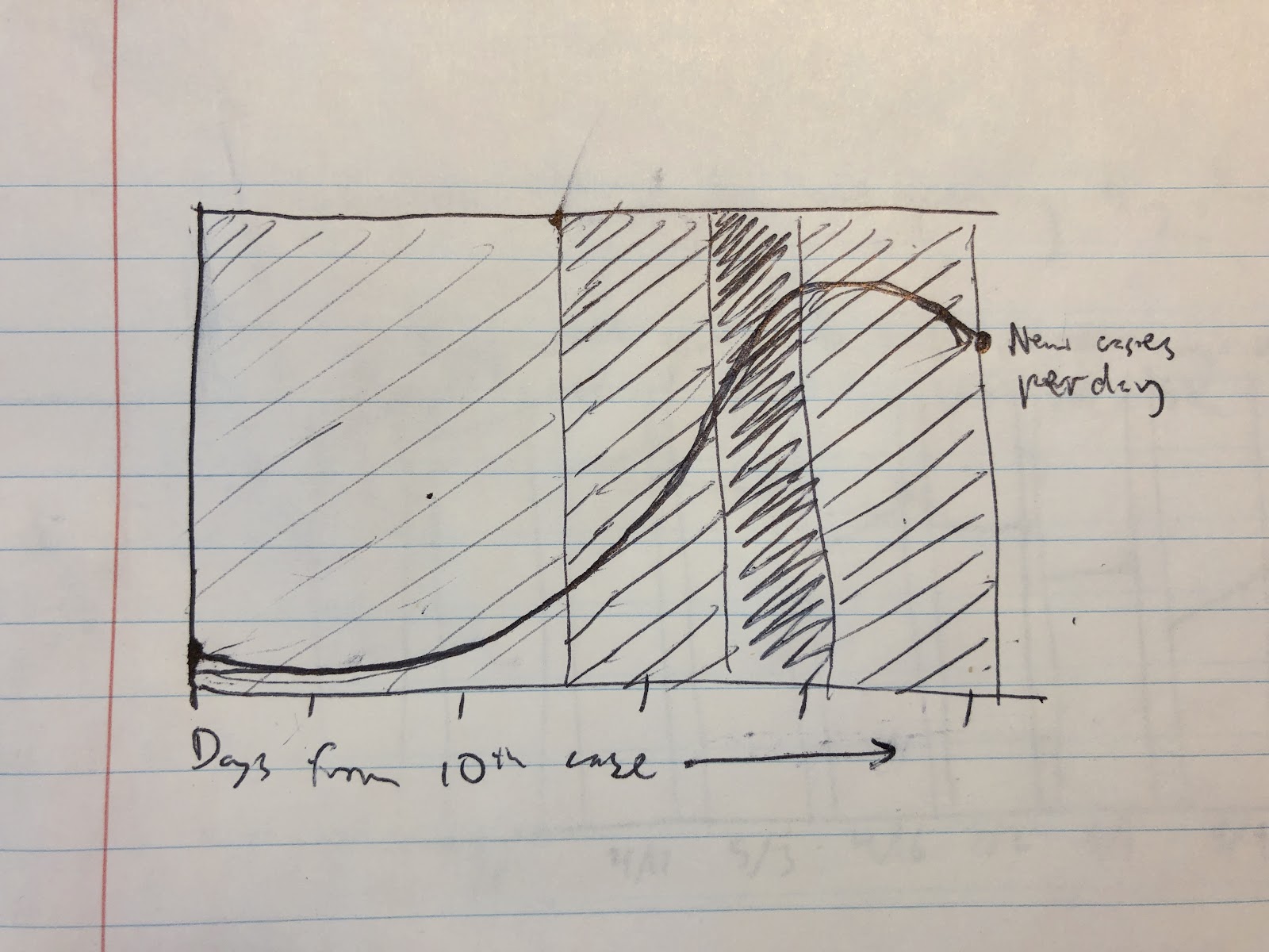
I wanted to visualize two variables over time without using dual axis line charts to avoid implying that the heights of the lines are related.
I chose black for the area charts as a neutral color that would provide a strong contrast with the background, which needed to include both light and dark colors of varying hues. For the background, I opted for a blue-orange scale to suggest increasing urgency without using a more negative color like red.

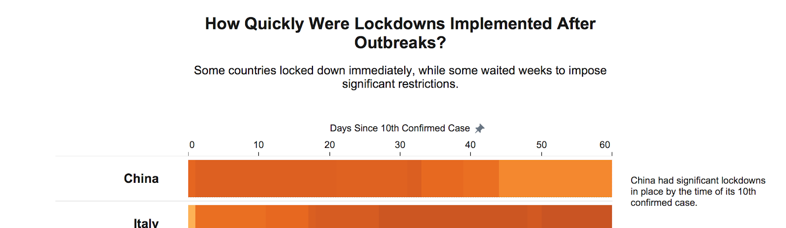
There were several stories in the data that I wanted to highlight, so I did this in a series of visualizations, writing chart titles with the goal of helping the user quickly understand what they should be looking for in each particular chart.
I included many annotations given the importance of interpretation with this visualization approach.
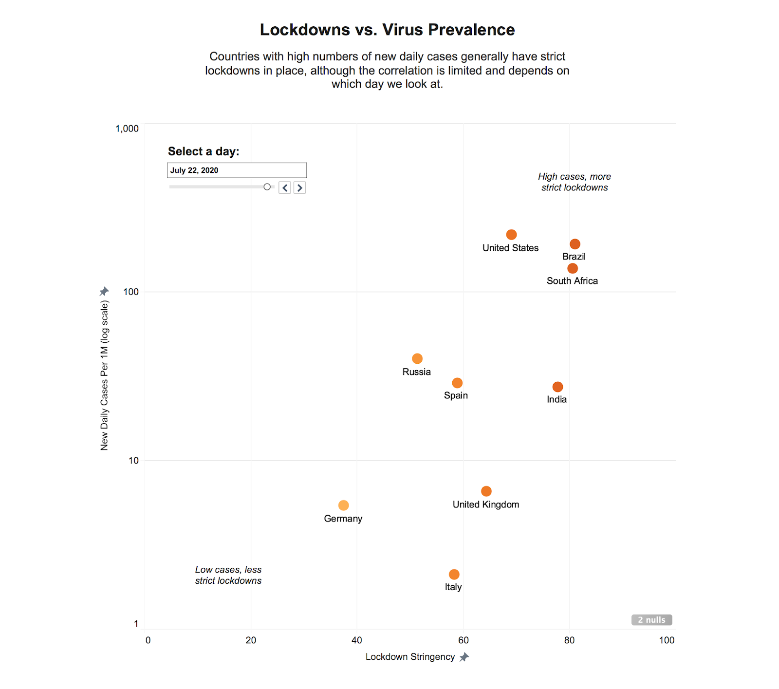
For the scatterplot, I chose to use a log scale. This felt like a risk, and the scale wasn’t immediately noticed by my user test participants, although I felt it was the only way to allow comparisons on this type of chart given the huge differences in the numbers of cases, and guessed that more data-savvy users would want a scatterplot to be able to see the correlation more clearly.
Process
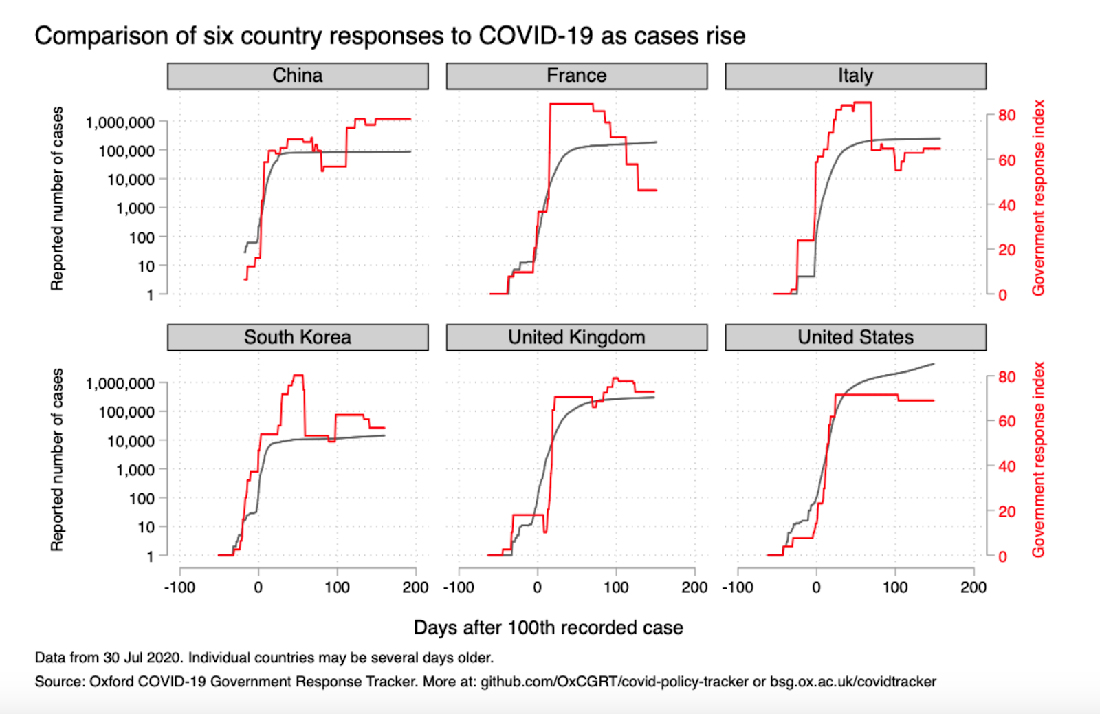
I started by reviewing existing visualizations. Oxford publishes charts (shown here) showing both the government response and the number of deaths over time, using two y-axes, with a log scale for deaths. While dual axis charts and log scales can both be difficult to interpret, Oxford’s presentation in the above is useful and led me to think about how else I could show two variables changing over time.
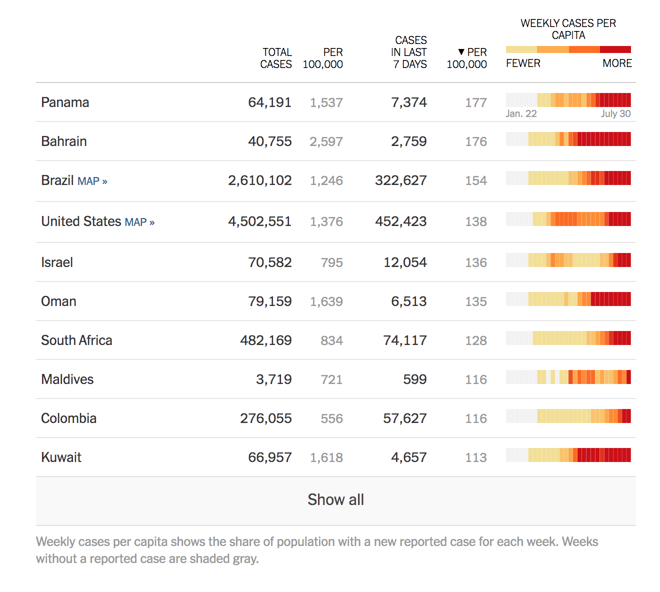
I also referenced coronavirus graphics by the New York Times and the Washington Post and how they dealt with the challenge of cases data that varies widely by country and exhibits exponential growth.
This visualization from the New York Times’ dashboard stuck in my mind as an example of a different way to show historical data for many localities in a compact format, and inspired some of my charts.
I began by drawing some rough ideas to help brainstorm visual approaches. This produced the ideas of using background fills in place of a dual axis, and using days since reopening on the x-axis rather than the actual date.
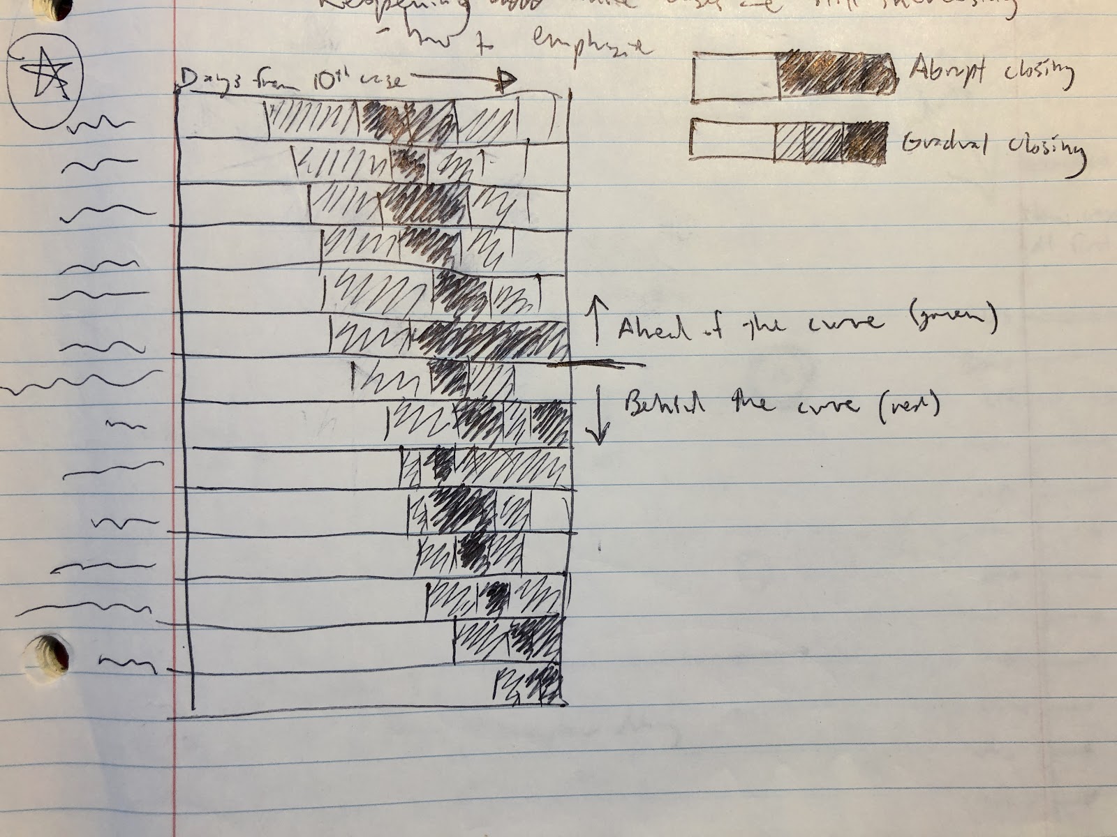
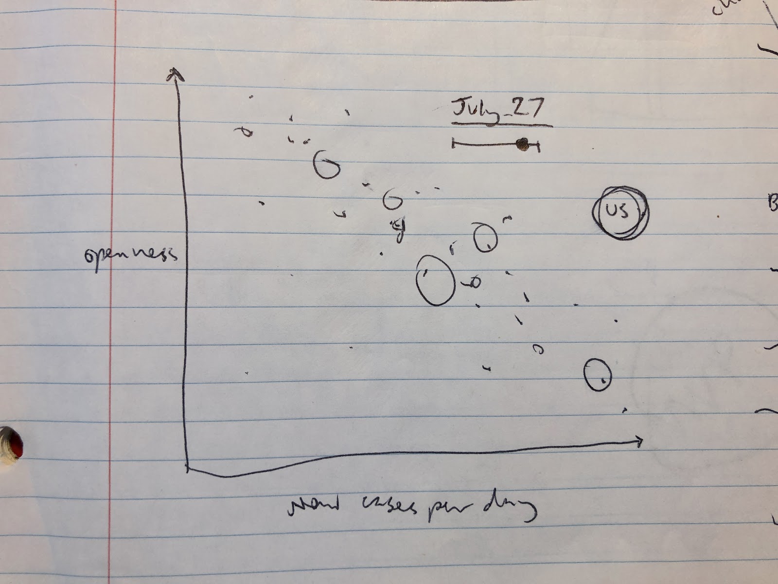
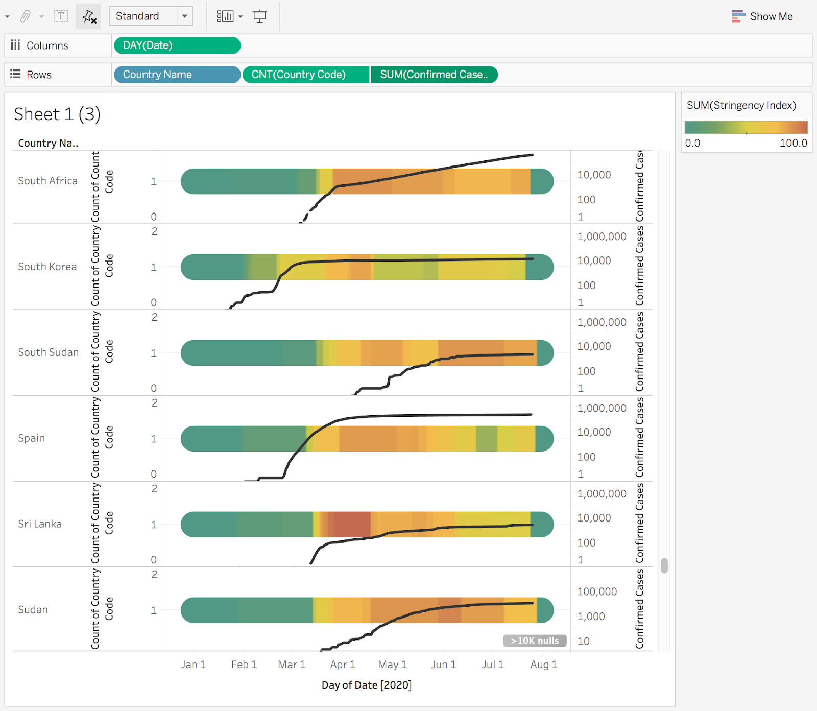
I used R to prepare the data and add additional variables, joining with cases and population data and adding key dates for each country: the date of the 10th case and the date of reopening (when the stringency index first decreased by a cumulative 10 points).
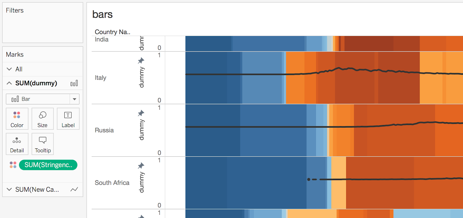
I created the visualizations in Tableau, going through several iterations before settling on the chart style.
I then conducted user testing with the Tableau prototype, observing test participants using the think aloud method. This led to some important changes such as more prominent axis labeling.