American Democracy is Rigged Against Democrats
- Project for Programming Interactive Data Visualizations, fall 2020
- Tools used: D3.js
Design
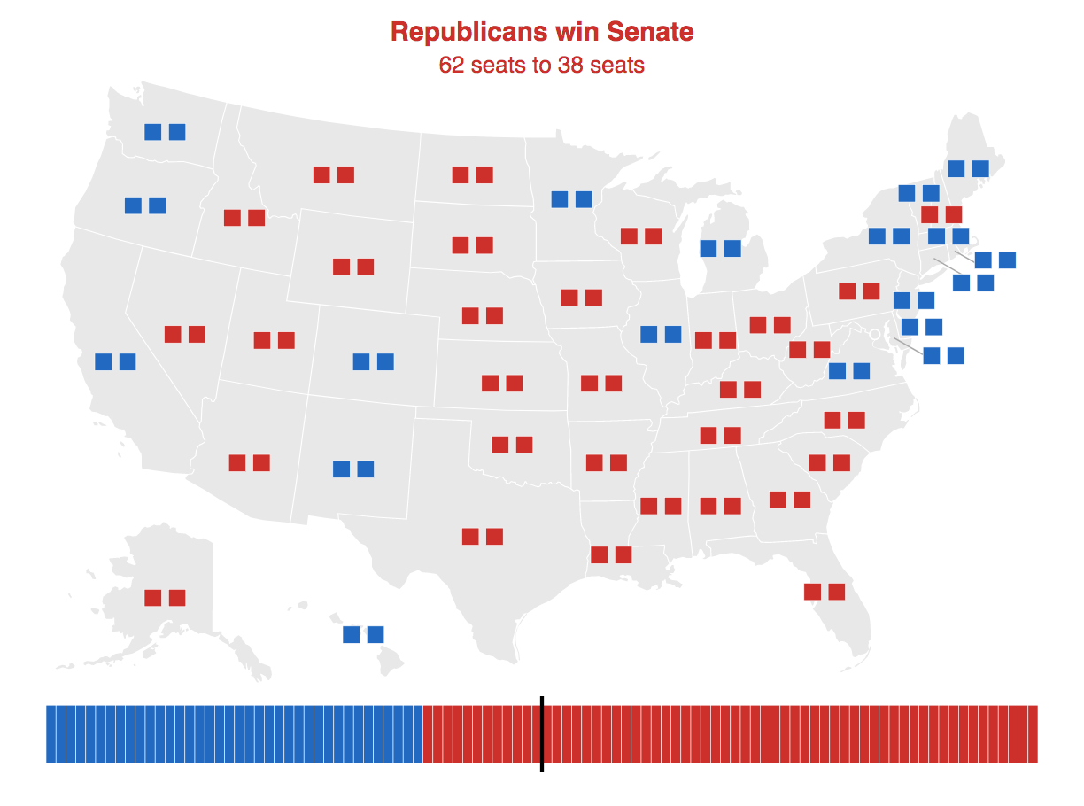
For this data storytelling project, I used D3 to create a single-page site to graphically show how the U.S. electoral system is biased against Democrats. While it is common knowledge that Donald Trump nearly won the election despite losing the popular vote, many informed voters are not aware of the extent of Republicans’ built-in advantages.
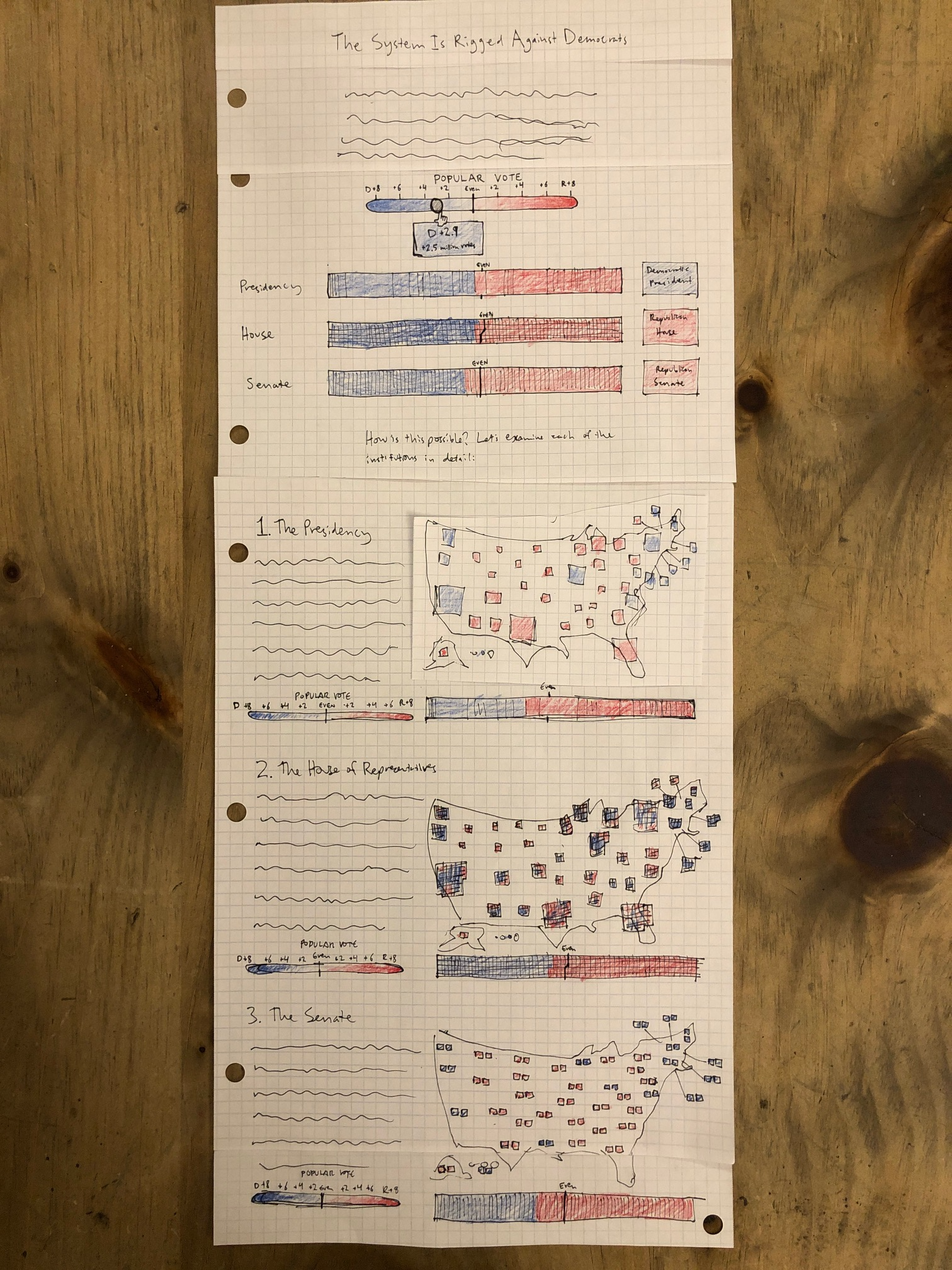
The user can choose a popular vote scenario with a slider and see which states and districts Republicans and Democrats would win, and which party would win control of the presidency, House, and Senate in that scenario.
The scenarios imagine that each state and district votes according to whether it leans Republican or Democrat after factoring in the popular vote scenario. In reality, there are many more variables involved, but the simple model is still instructive.
I wanted to provide a choice of scenarios because it seemed both fun and informative, and also did not detract from the main point, which is evident in the default states.
To help the user quickly grasp the main point, I included prominent messages explaining which party won each institution in the chosen scenario. While simple, my guess is these messages may be more important than the maps or bar charts for helping users understand the issue.
I experimented with different reds and blues and opted for colors that I felt were relatively bright while still being readable on a white background and not clashing when adjacent to one another.
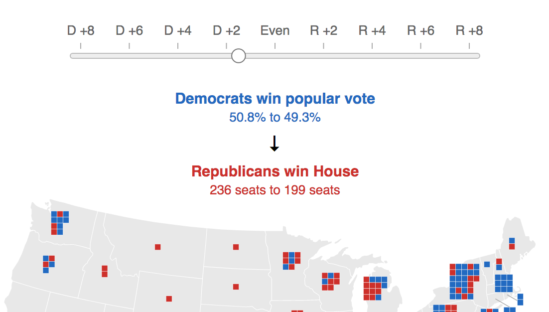
My goal in using both maps and charts was to show how winning states and districts adds up to winning control of an institution, and the differences in how control is determined in each case. I chose to color the rectangles solid red or blue - a gradient could have showed margin of victory, but I wanted to emphasize the winner-take-all concept since that is the root of the problem for Democrats.
Process
Implementing multiple sections required a good amount of research and refactoring of the code, which was educational.
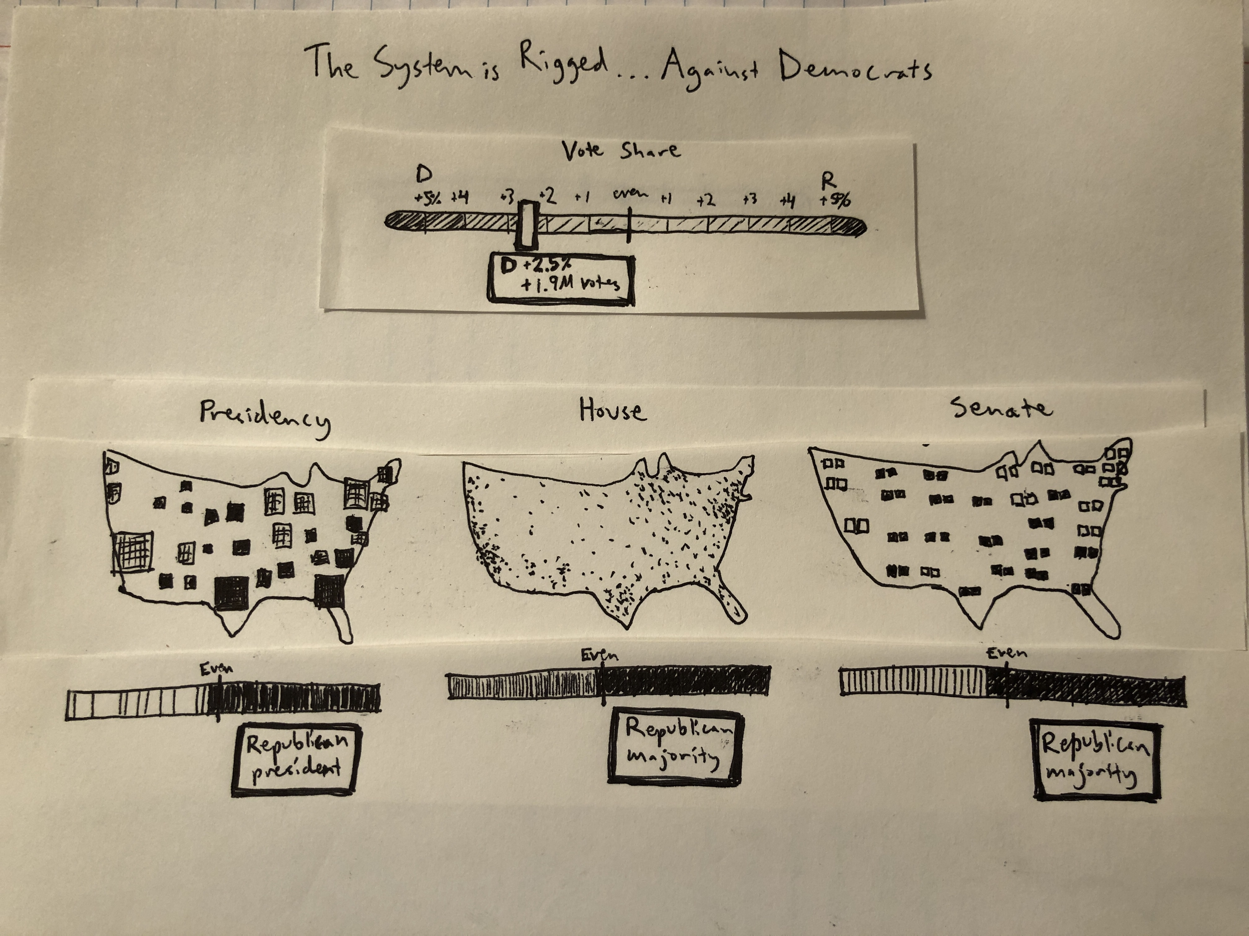
I began with detailed colored pencil sketches, and iterated on the layout based on feedback, breaking the page into four sections and including more narrative text.
In future iterations, I would implement a more complex data model for the popular vote scenarios, and make the graphics responsive. I’d also like to conduct user testing to gauge whether the site communicates successfully.